Project : Packaging designs
Year : 2021
FR / EN / JP
FR
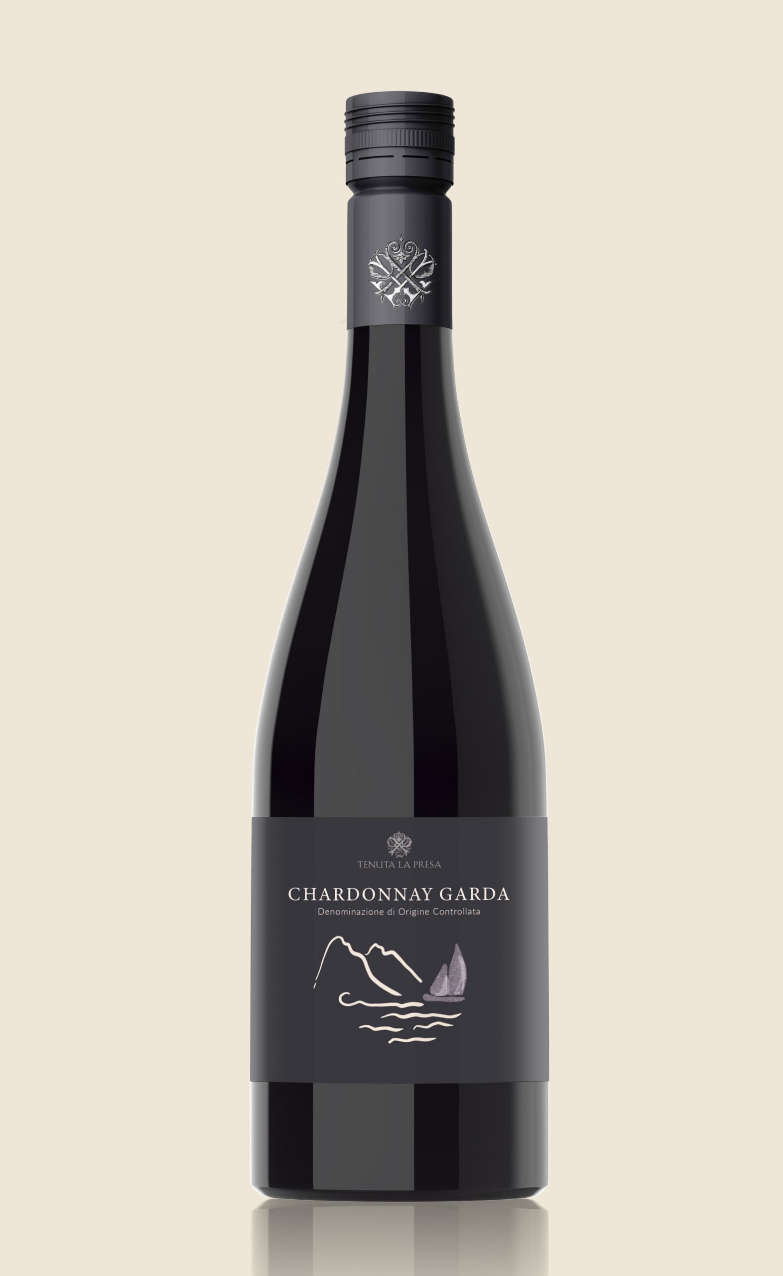
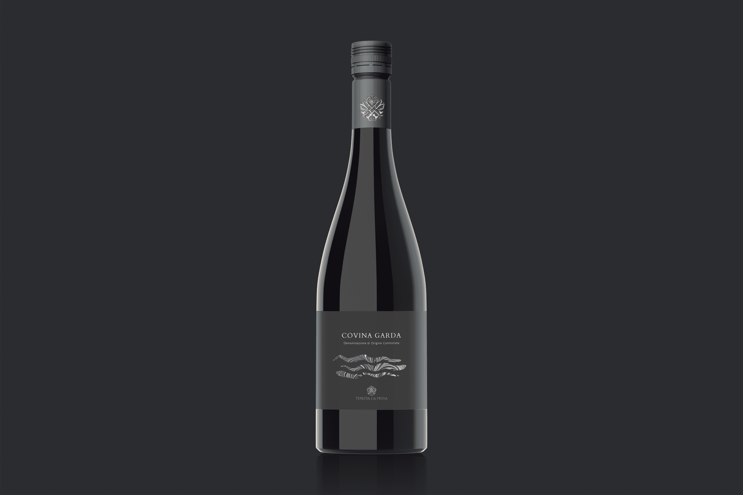
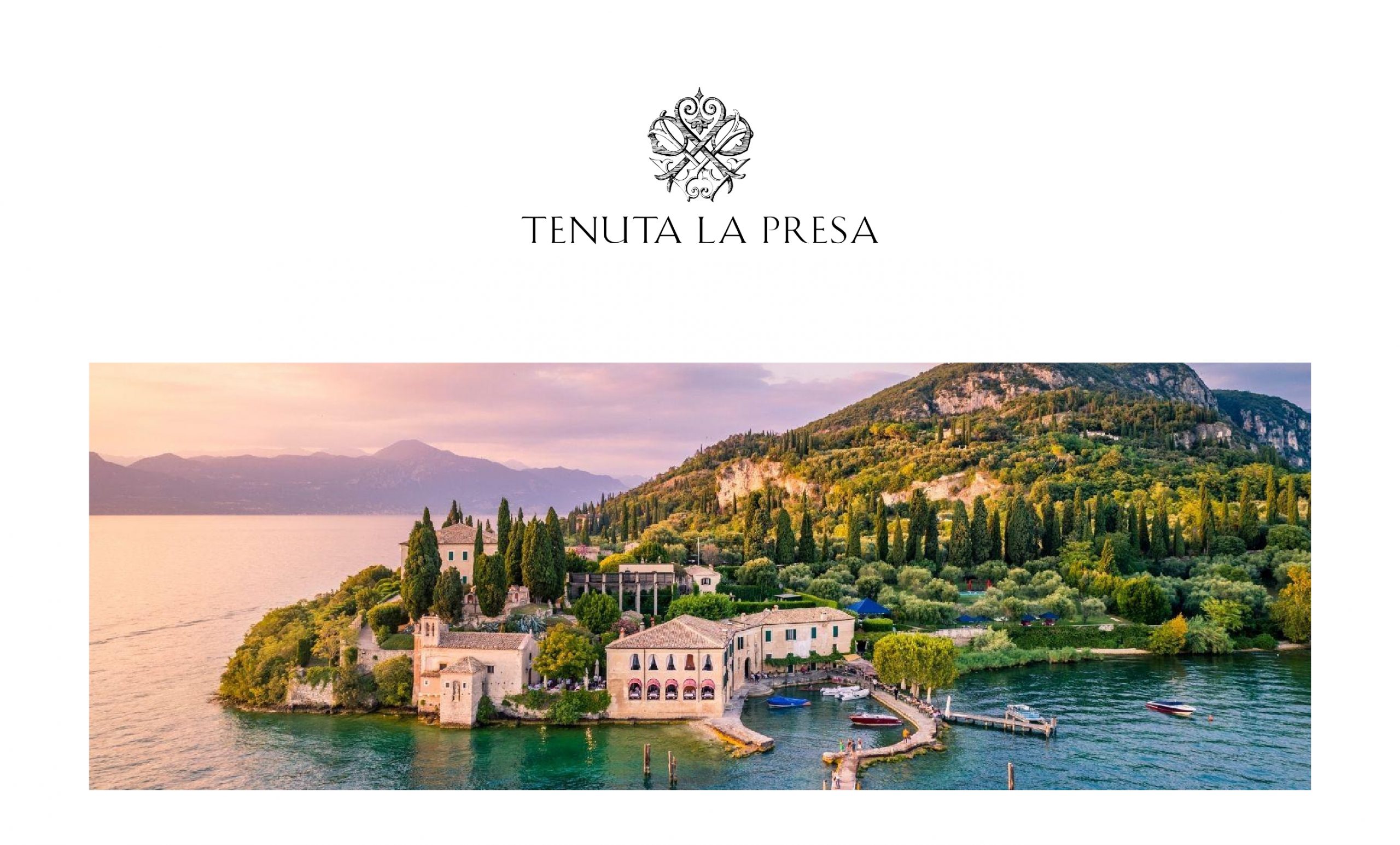
Tenuta La Presa est un domaine viticole situé dans la magnifique région de Vénétie, en Italie.
Cette étiquette de vin a été conçue dans le cadre d’un concours de design.
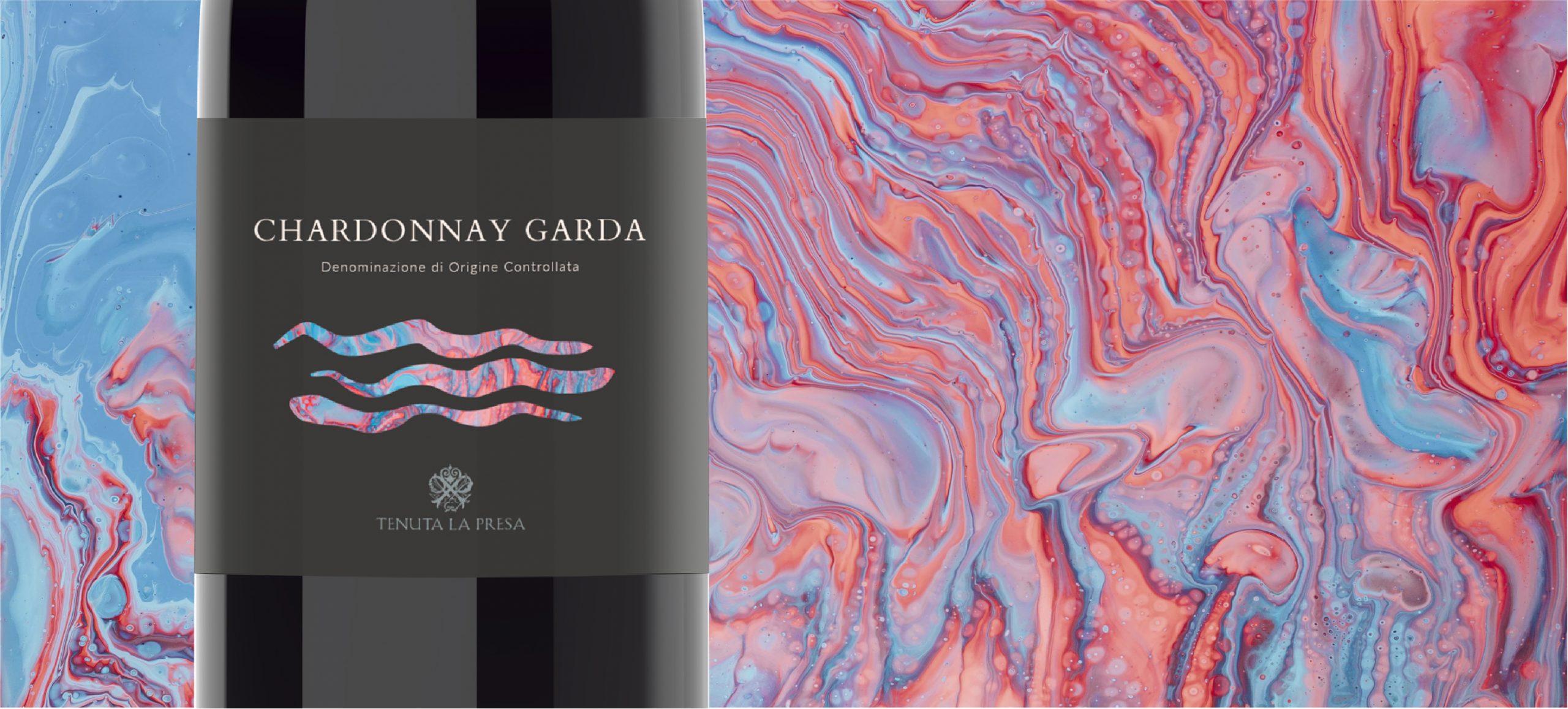
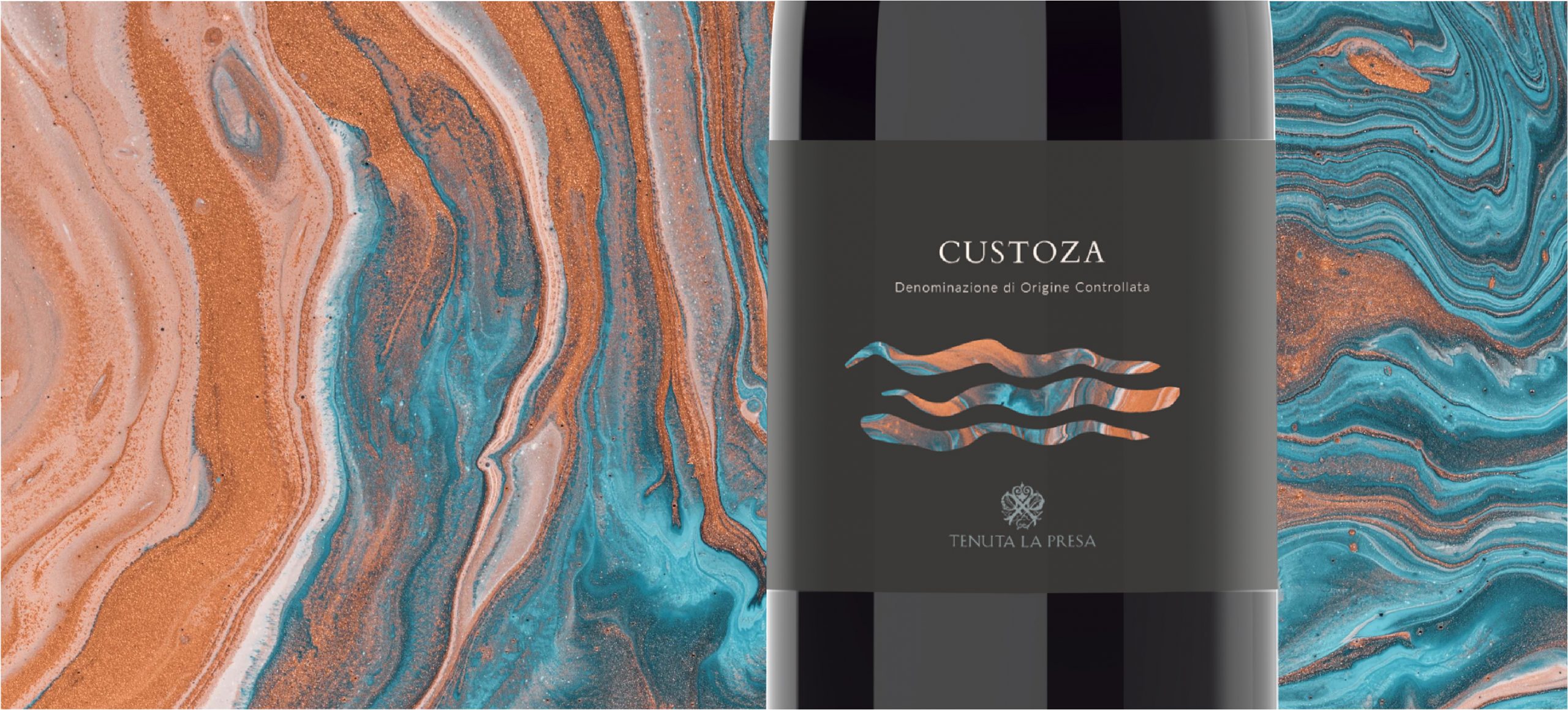
Pour le lancement d’une nouvelle gamme de vins dédiée au lac de Garde, Tenuta La Presa souhaitait un design simple et unique, avec des couleurs variées et élégantes.
En harmonie avec les caractéristiques de son territoire, le design vise à évoquer le lac tout en reflétant les arômes élégants et vifs du vin.
La couleur de fond texturée est issue d’un papier marbré fabriqué localement (un art traditionnel en Vénétie et dans d’autres régions d’Italie).
EN
Tenuta La Presa is a winery located in the beautiful Veneto region of Italy.
This wine label was designed as part of a design competition.
For the launch of a new wine range dedicated to Lake Garda, Tenuta La Presa wanted a simple and unique design, featuring a variety of elegant colors.
In harmony with the characteristics of its territory, the design aims to evoke the lake while reflecting the wine’s elegant and lively aromas.
The textured background color comes from locally made marbled paper, a traditional craft in Veneto and other regions of Italy.
JP
Tenuta La Presa は、イタリアの美しいヴェネト州にあるワイナリーです。
このワインラベルは、デザインコンペティションの一環として制作されました。
ガルダ湖にちなんだ新しいワインシリーズの立ち上げにあたり、Tenuta La Presa はシンプルでユニークなデザインを求め、さまざまな上品な色合いを取り入れました。
土地の特性と調和するように、デザインは湖を想起させつつ、ワインのエレガントで生き生きとした香りを表現しています。
テクスチャのある背景色は、ヴェネト州やイタリアの他の地域に伝わる伝統工芸である、地元製のマーブル紙から作られています。

FR
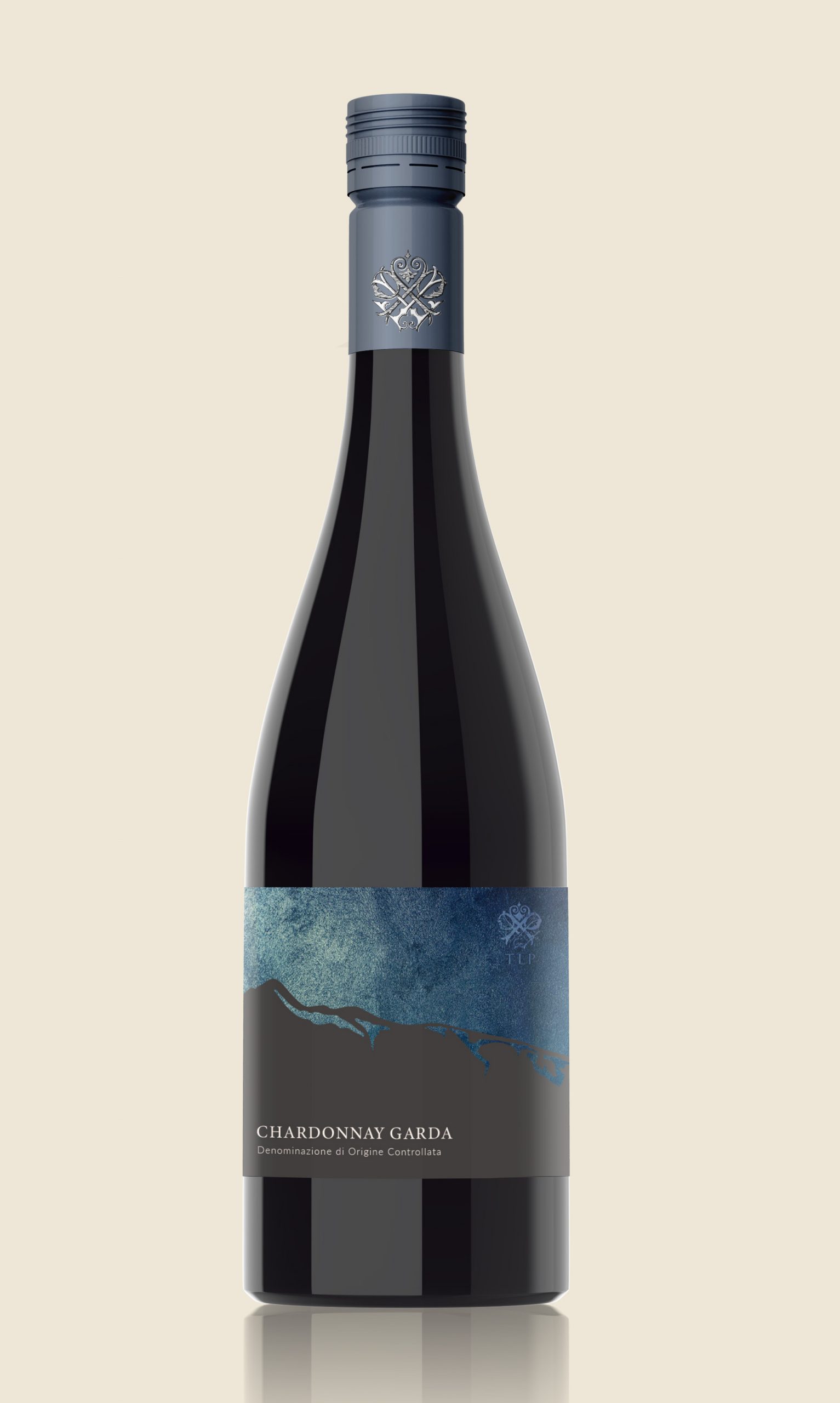
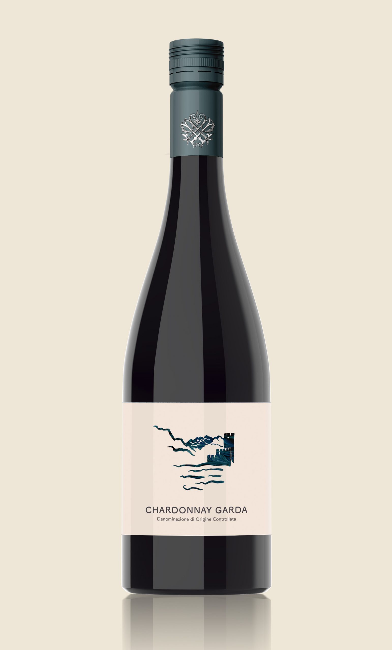
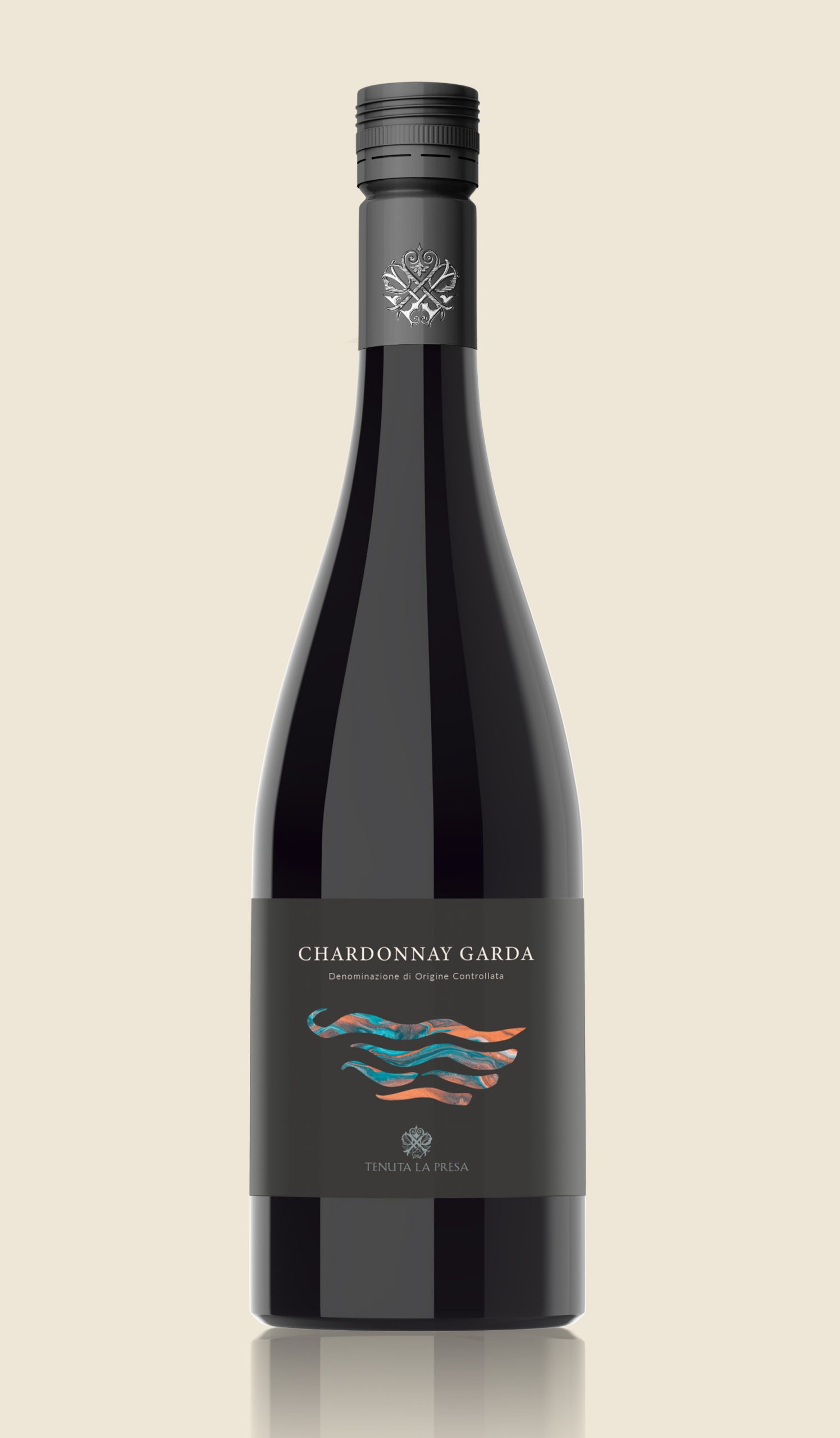
Les designs suivant n’ont pas été commercialisés mais étaient sélectionnés parmi les idées à garder, et nous les aimons beaucoup aussi:)
EN
The following designs were not commercialized, but they were selected among the ideas to keep, and we like them very much as well 🙂
JP
以下のデザインは商品化されませんでしたが、キープするアイデアの中から選ばれたもので、私たちもとても気に入っています 🙂