The 3 essential Logo variations: Primary Logo, Secondary Logo & Submark
Most brands don’t rely on a single logo. A professional visual identity is built from two to three essential variations that work together across every touchpoint: the primary logo, the secondary logo, and the submark.
While they are often confused with general logo types (like wordmarks or monograms), these three variations are not different styles — they are different formats of the same logo, each serving a specific purpose.
In this guide, you’ll learn what each variation is, when to use it, and how they create a flexible and cohesive brand identity.
What Are Logo Variations?
Unlike logo categories (such as wordmarks or symbols), logo variations are different formats of the same brand mark.
They allow a visual identity to remain consistent while adapting to different sizes, layouts and contexts.
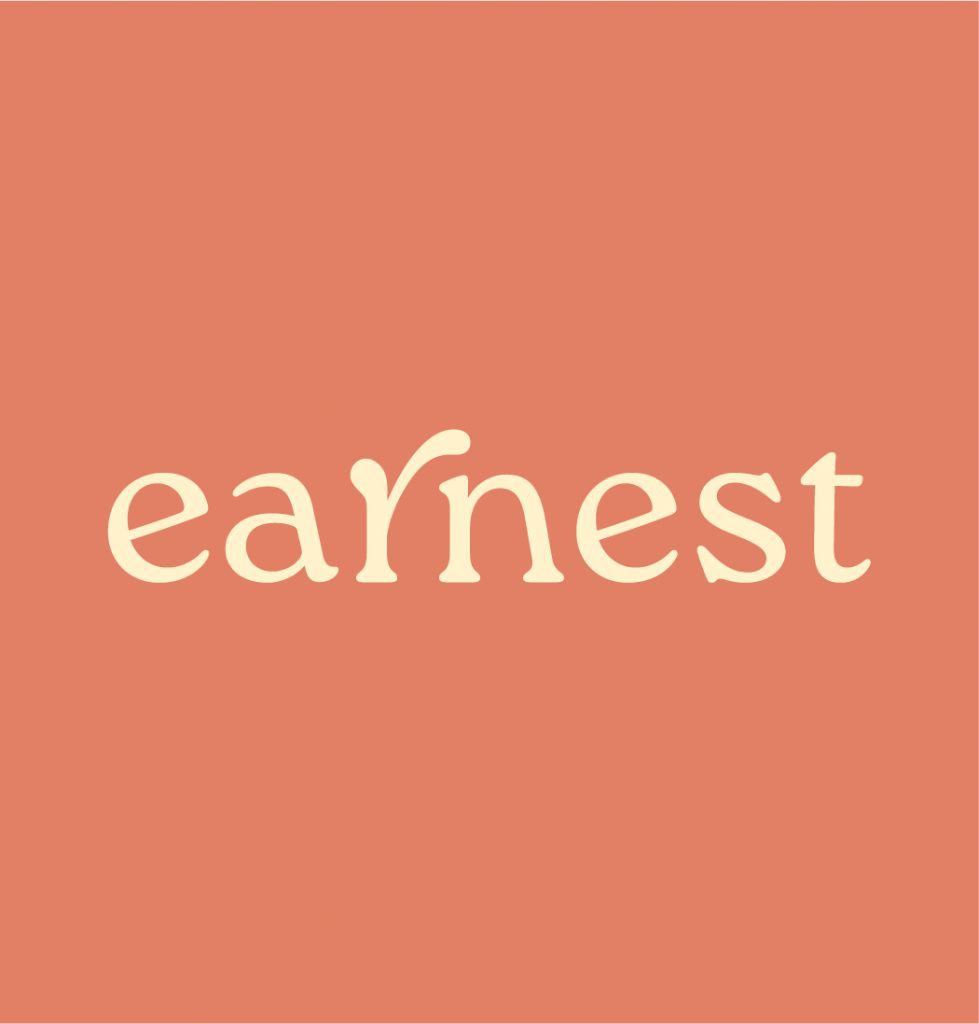
Primary Logo (Main Logo)
- Used most of the time
- Includes full business name
- May include tagline, website, or geographic location
The primary logo is the main graphic that represents your business and is used most often. When designing the primary logo, our goal is to communicate who you are, what you offer, or where you operate. This logo may include your company’s tagline, website, or geographic location.
Secondary Logo (Alternate Logo)
- Simplified design & text
- Used only when the logo is resized small
- Includes full business name
A secondary logo is a simplified or alternate layout of the main logo; often horizontal or stacked.
This design may eliminate some text or rearrange the elements to improve readability in small sizes. Secondary logos are intended for online use or when you must resize your logo to small formats.
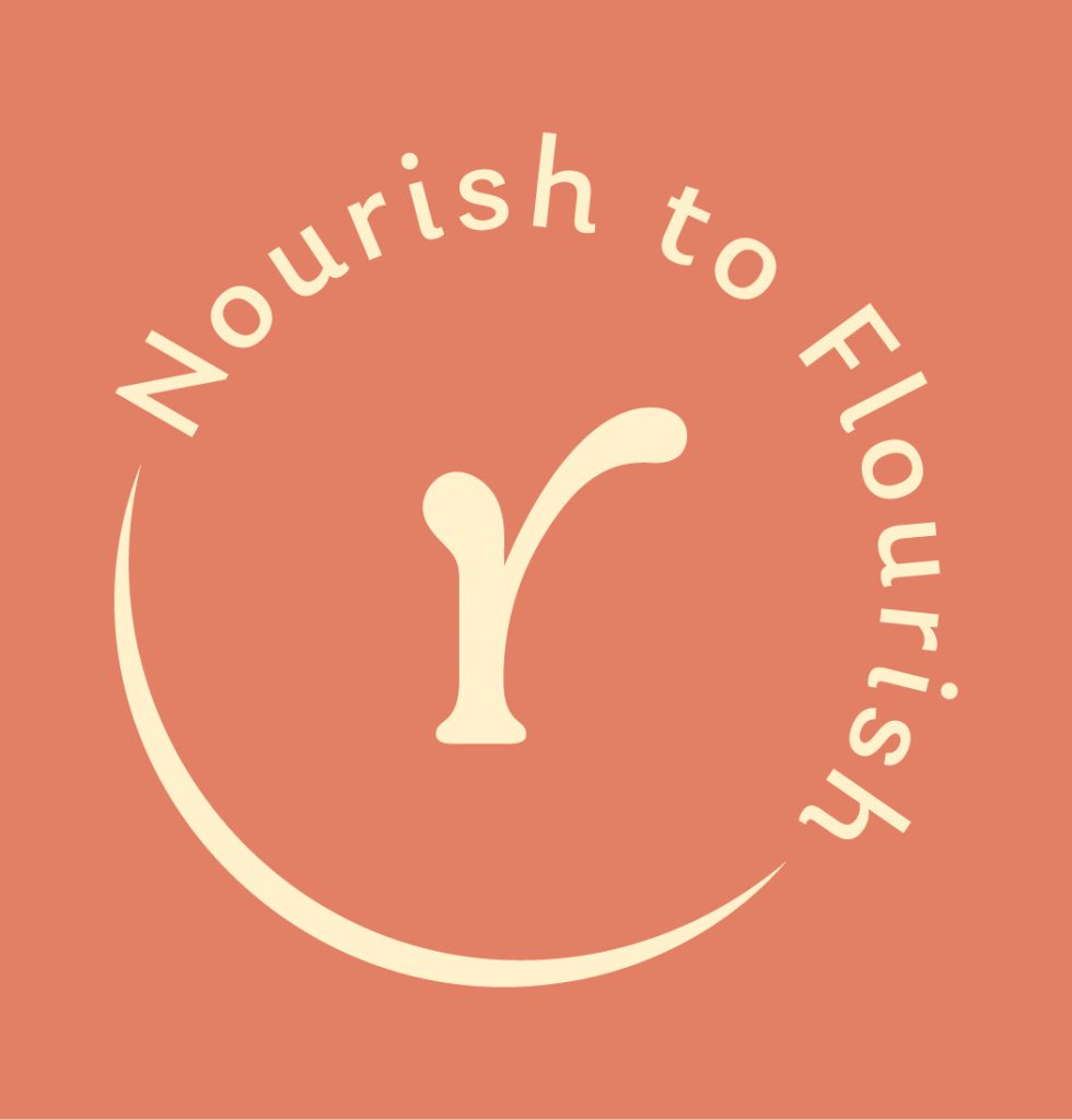
Submark (Icon Logo)
- Commonly used online and on social media
- Used when logo is resized to extra small formats
- Includes single letter(s), number(s), or symbol
A sub-mark logo is a stripped down graphic of your main logo.
It is the smallest and most minimal variation of the logo, usually circular or monogram-based. It is ideal for social media profiles, stamps, stickers, watermarks or favicon use, where the full logo would be unreadable.
Other Logo Categories
Outside of logo variations, designers also classify logos into broader categories, such as wordmarks, monograms, brandmarks, combination marks and emblems. These describe the style of a logo, not how it functions inside a brand system
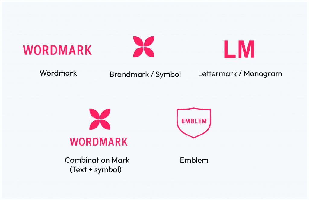
• Wordmark : a logo made only from the brand name (e.g., Google)
• Brandmark / Symbol : an icon without text (e.g., Apple’s apple)
• Lettermark / Monogram : initials instead of the full name (e.g., HBO)
• Combination Mark : text + symbol used together
• Emblem : text placed inside a badge or shape (often traditional)
These categories describe the style of a logo, not how it is used within a brand system.
Why you need more than one logo
A single logo cannot stay readable, balanced and consistent across every format.
Using multiple variations ensures flexibility, professionalism and brand recognition at every scale.
It helps you with:
- better readability across small and large formats
- consistent branding on digital and print
- improved visual hierarchy
- professional, cohesive brand presentation
To build a strong brand you must have a brand identity that translates well online, in print, and on merchandise.
A strong brand identity is not defined by one logo, but by a system that adapts with clarity and intention.
If you’re ready to build a visual identity that feels refined, consistent and truly aligned with your brand, we’d be happy to support you.