How Typography Influences the Perception of Safety and Quality in a Product
In branding, typography is often seen as a purely aesthetic choice.
As if selecting a beautiful typeface, a consistent size, and a clear hierarchy were enough.
But in reality, typography is not just seen. It is felt.
A recent study by Kulczynski & Hook (2023) reveals something fascinating:
typographic choices directly influence how safe a product feels.
A product can be perceived as safer, more reliable, and higher quality solely because of the style of its typography.
For brands, this represents a powerful -and often underestimated- lever to build trust and create an immediate emotional connection with consumers.
1. The Brain Doesn’t Just Read : It Interprets and Predicts
Let’s play a quick game.
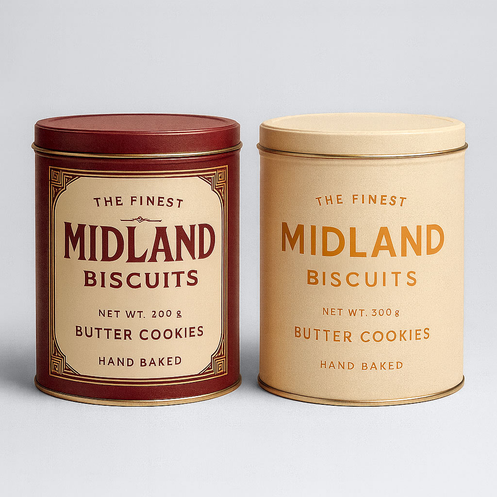
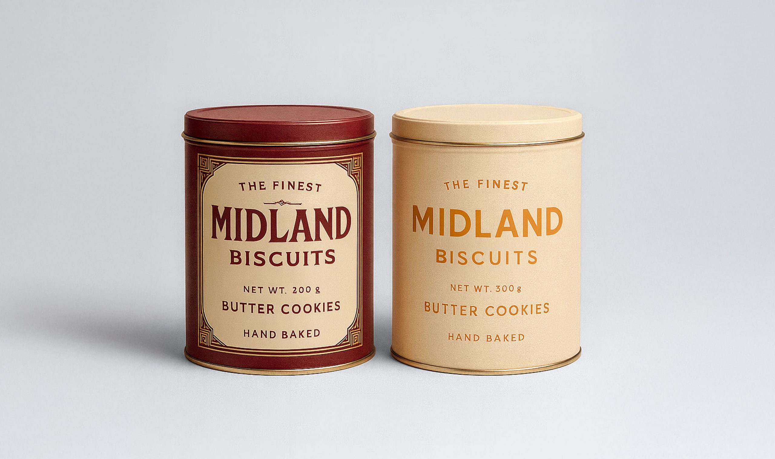
Looking at these two products:
Which one feels more trustworthy to you?
Did you choose the one on the left?
That’s very likely.
When we look at a product, we believe we are analyzing objective visual elements.
In reality, our brain operates through prediction.
It detects visual cues (shapes, colors, textures, styles) and compares them to familiar mental patterns to quickly answer:
- Is this trustworthy?
- Is this high quality?
- Is this safe?
- Is this familiar?
These predictions happen in a fraction of a second, long before we consciously analyze the product.
Vintage Anemoia: Nostalgia Without Memory
Vintage typography, inspired by Art Deco, Bauhaus, or historical packaging design, triggers a sense of nostalgia, even in people who never lived through those eras.
Researchers call this phenomenon Vintage Anemoia:
A nostalgia for a time never personally experienced.
This feeling activates automatic associations such as:
- “Old = proven”
- “Detailed = made with care”
- “Tradition = reliability”
Even if the product is brand new, the aesthetic feels familiar.
And what feels familiar tends to feel… safer.
2. The Experiment: Two Identical Boxes, Two Opposite Perceptions
In the study, participants were shown two strictly identical boxes.
The only difference was the typographic style on the label.
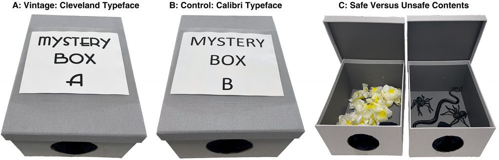
- Box A: vintage typography
- Box B: modern, neutral typography
Participants were told that one box contained something harmless (a flower, a necklace), while the other might contain something unpleasant (plastic spiders).
The result? 👉 The majority identified the box with vintage typography as the “safe” one.
Even more surprising:
When warned that their choice might be misleading, participants still maintained their preference.
Why?
Because vintage typography acts as a cognitive shortcut:
“This looks familiar → therefore it must be trustworthy.”
3. The Effects of Vintage Typography on Perception
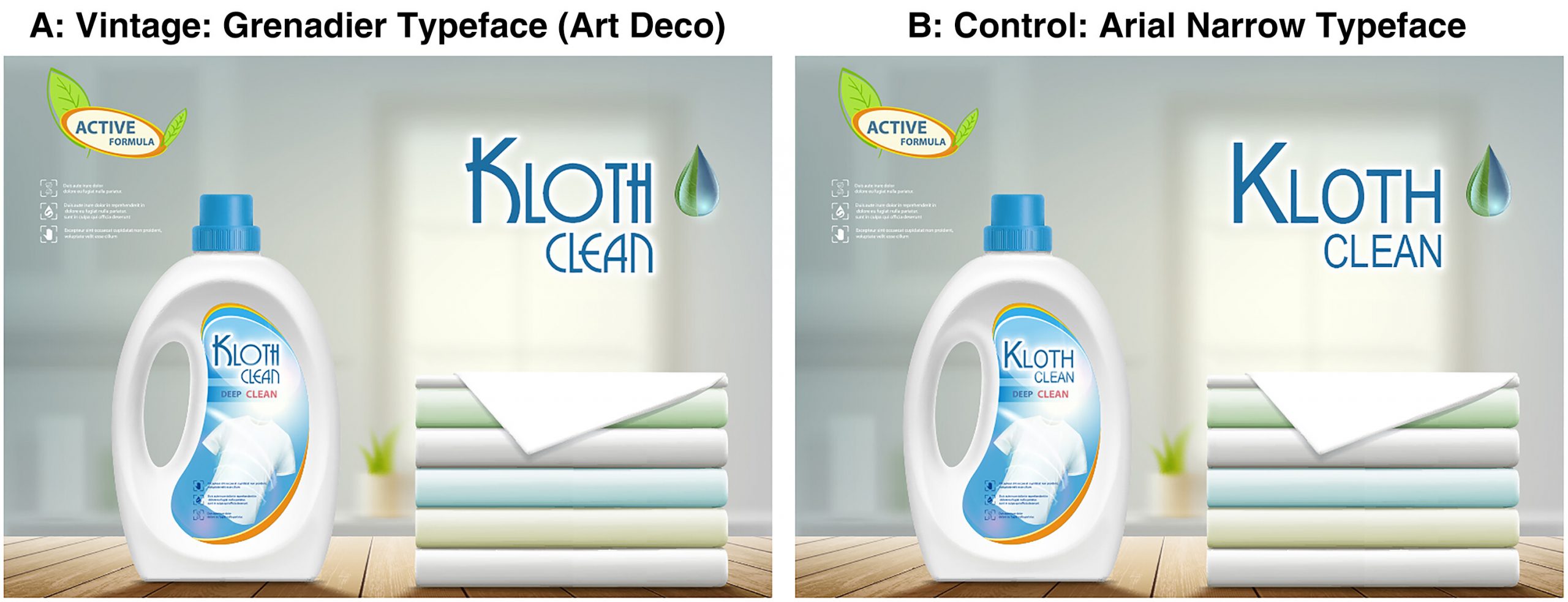
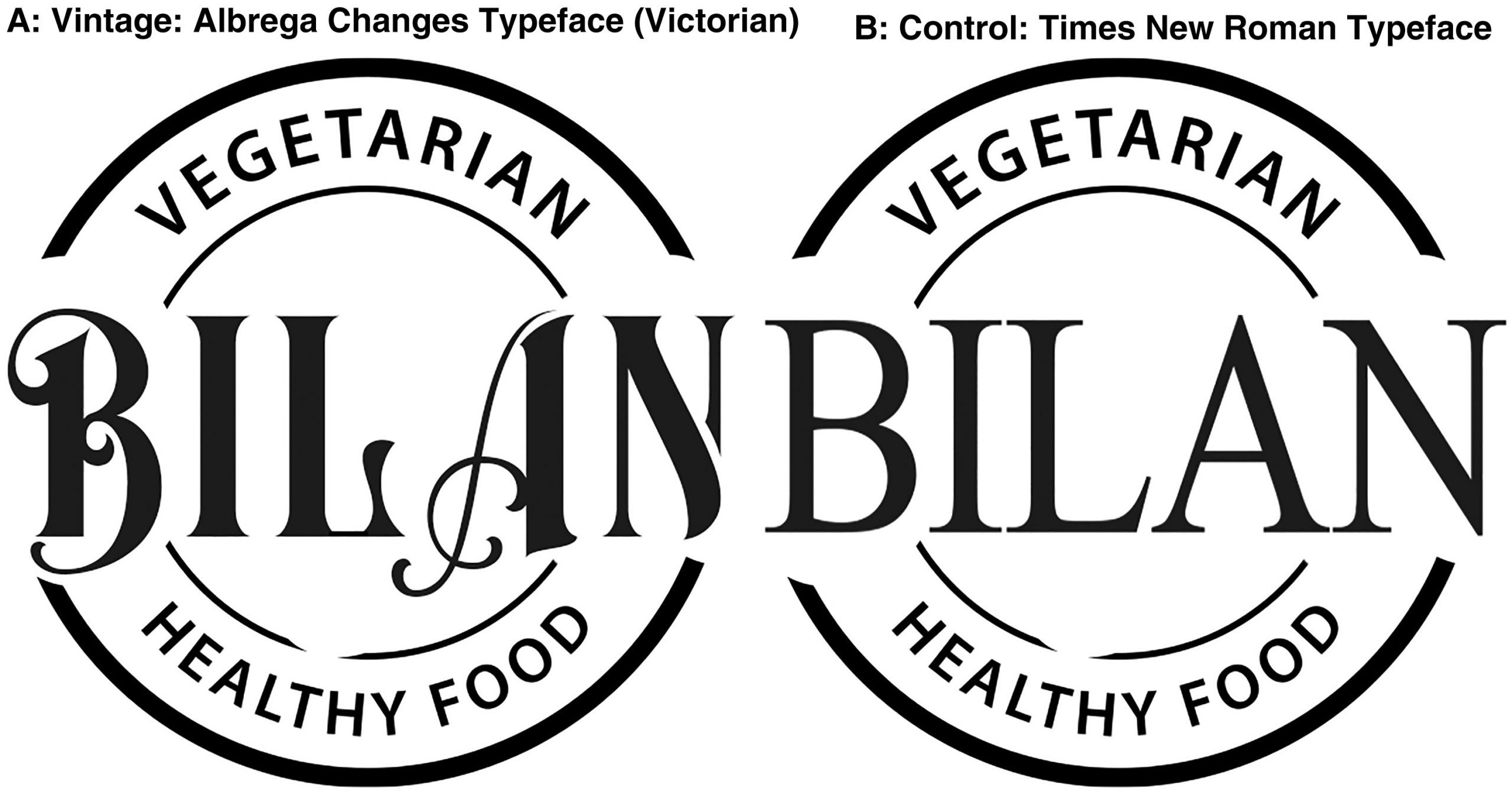
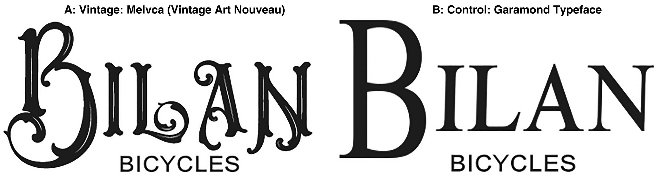
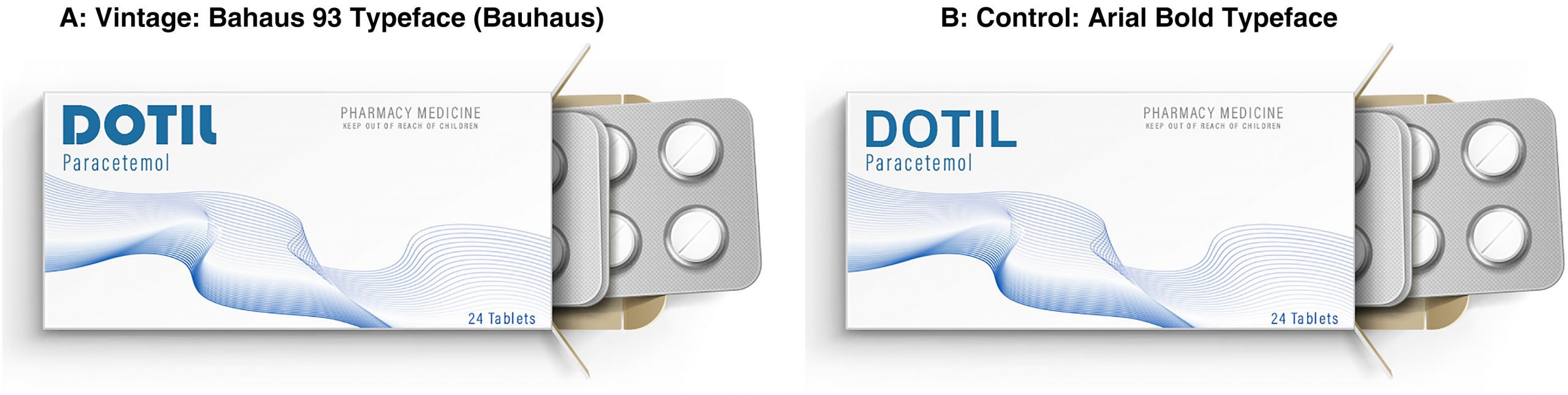
Images and source article : https://journals.sagepub.com/doi/10.1177/00222429231215357
Across multiple variations of the experiment, researchers observed consistent results.
Products using vintage typography were perceived as:
🔹 Safer
Consumers anticipated fewer risks.
🔹 Higher quality
Detail and ornamentation suggested craftsmanship and care.
🔹 More authentic
Vintage styles evoke traditional know-how and heritage.
🔹 Warmer
The design triggered a sense of proximity and human connection.
This is not just a graphic style choice.
Vintage typography activates an emotional response that directly influences purchasing decisions.
4. What This Means for Brands
This study confirms a core principle of branding and design psychology:
consumers don’t choose products only for what they are, but for how they make them feel.
Typography can therefore:
- reinforce trust
- increase perceived value
- create implicit storytelling
- establish an immediate emotional connection
- differentiate a product in a saturated market
In industries such as specialty coffee, tea, artisanal food, natural cosmetics, or terroir-based products, vintage typography can become a strong competitive advantage.
However, it only works when the style is aligned with the brand’s identity.
For example, using a retro typographic style on a tech or futuristic product may create visual dissonance.
When the brain detects inconsistency, the effect disappears.aît.
5. How to Use Vintage Typography Strategically
Here are a few guidelines for brands and design studios.
1. Clarify the Emotional Intention
Before choosing a typeface, ask one essential question: What should my customer feel at first glance?
If the answer is trust, warmth, authenticity, craftsmanship, or quality —
then vintage typography may be a relevant choice.
2. Use Vintage Typography with Subtlety
The goal is not to create a fully “retro” look, but to introduce refined touches:
- a slightly ornamental serif
- a monogram inspired by old engravings
- geometric typographic details
- an Art Deco–inspired headline
Vintage typography works best when it remains modern and controlled.
3. Create Consistency Across the Visual Identity
Typography should interact harmoniously with:
- the color palette
- packaging textures
- illustrations
- overall composition
A well-integrated vintage style creates a complete atmosphere, not an isolated effect.
4. Never Use Vintage to “Deceive”
The goal is not manipulation, but credibility.
Typography should reflect a genuine intention: craftsmanship, tradition, know-how, proximity.
Otherwise, consumers will sense the inconsistency.
Conclusion
Typography is not a minor aesthetic detail.
it is a powerful psychological tool that deeply influences how a product is perceived.
Vintage typography activates familiarity and nostalgia, making products feel safer, higher quality, and more trustworthy.
For brands, this is an opportunity to create a visual identity that speaks to both the brain and emotions.